
Annual Enrollment
Annual Enrollment is the yearly period when employees review and select their benefits for the upcoming plan year through the Alight Worklife platform.
Project Overview
Alight has redesigned its Annual Enrollment experience to move beyond today’s long, click‑heavy process by simplifying page turns, improving navigation and introducing more personalized, holistic plan recommendations that reduces friction, improves clarity, and addresses common client concerns about speed, usability, and user confidence.
My Role
Lead Product Designer, Led the end‑to‑end design process, hands on designer, managed a team of 3 designers
Team
3 Designers, 2 UX Researchers, and the product health team including 1 Product manager
What We Were Solving
Business Problem
Employers were investing heavily in their benefits programs, but the enrollment experience wasn't helping employees realize that value.
The existing flow was fragmented across disconnected tools and lacked a single integrated experience that combined decision support with actual enrollment.
The result was higher call center volume.
Lower adoption of cost-efficient plans.
And underutilization of employer-funded programs.
With legacy components aging out and competitive pressure mounting, the enrollment experience had become a differentiation risk for Alight.
User Problem
Annual Enrollment forced employees through a long, one-size-fits-all flow with no personalized guidance and little context to help them make confident decisions.
Faced with complex plan options.
Minimal support.
Many users completed enrollment without truly understanding what they had selected.
Solution
The redesigned enrollment experience consolidates previously fragmented tools into a streamlined, personalized flow.
By introducing tailored health packages and simplifying how benefits are presented, the solution significantly reduces cognitive load.
Minimizes page-to-page navigation.
And helps employees make confident, informed decisions with considerably less effort.
10/10
Success rate
Overall end‑to‑end success rate
(From usability testing)
Results at a Glance
8/10
Confidence
Plan selection confidence
(From usability testing)
10/10
Personalization
Participants felt packages were personalized to them
(From usability testing)
Targeted
Support Ticket volume
High support volume during AE was a known client pain point, this redesign targeted the root cause by reducing confusion and decision friction.
1 Unified Flow
Consolidated design
Replaced fragmented legacy tools with a single, unified enrollment flow, reducing complexity for both users and clients.
70% ↓
Page Reduction
Reduced pages from 20 to 6
These results informed a phased rollout now in active deployment across client populations through 2027.
Where We Started
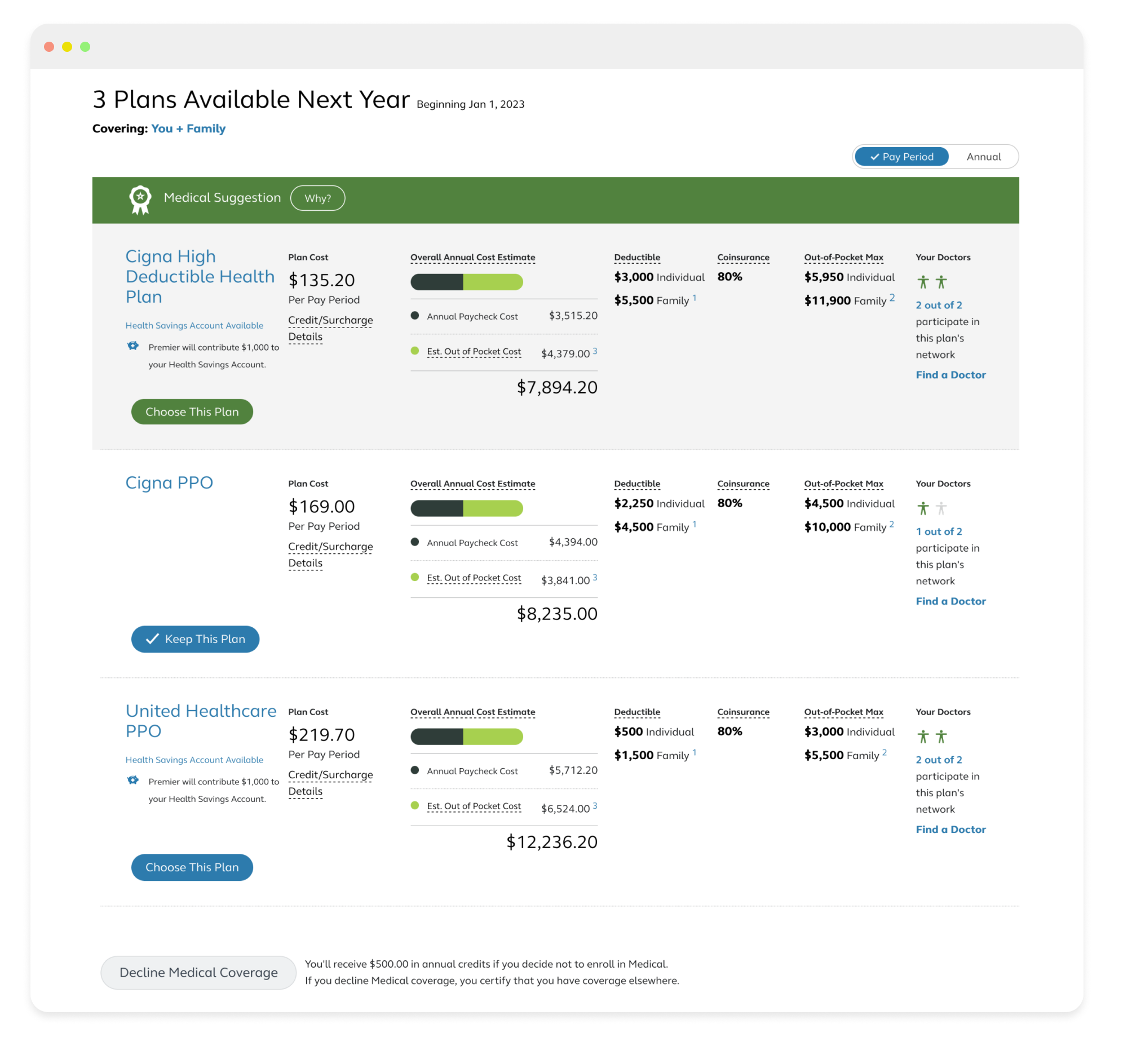
Classic Alight Annual Enrollment flow
The Alight Annual Enrollment flow had remained unchanged for years. This project aimed to modernize the experience by updating the flow to align with Alight’s new design system while improving the experience.
Discovery Process
Research and alignment
Understanding the problem area
I guided my designer through a structured discovery phase focused on identifying key pain points in the current experience, as well as uncovering meaningful opportunity areas In parallel, I directed a competitive landscape analysis to assess how similar products approach these challenges.
Defining the problem
Building on existing research and personas, I led the team in synthesizing key insights to clarify the problem space and set design direction. We surfaced core issues including low user confidence, page turn fatigue, and unpersonalized plan options. I facilitated a Crazy 8s workshop to drive alignment around high-impact opportunities.
User flow
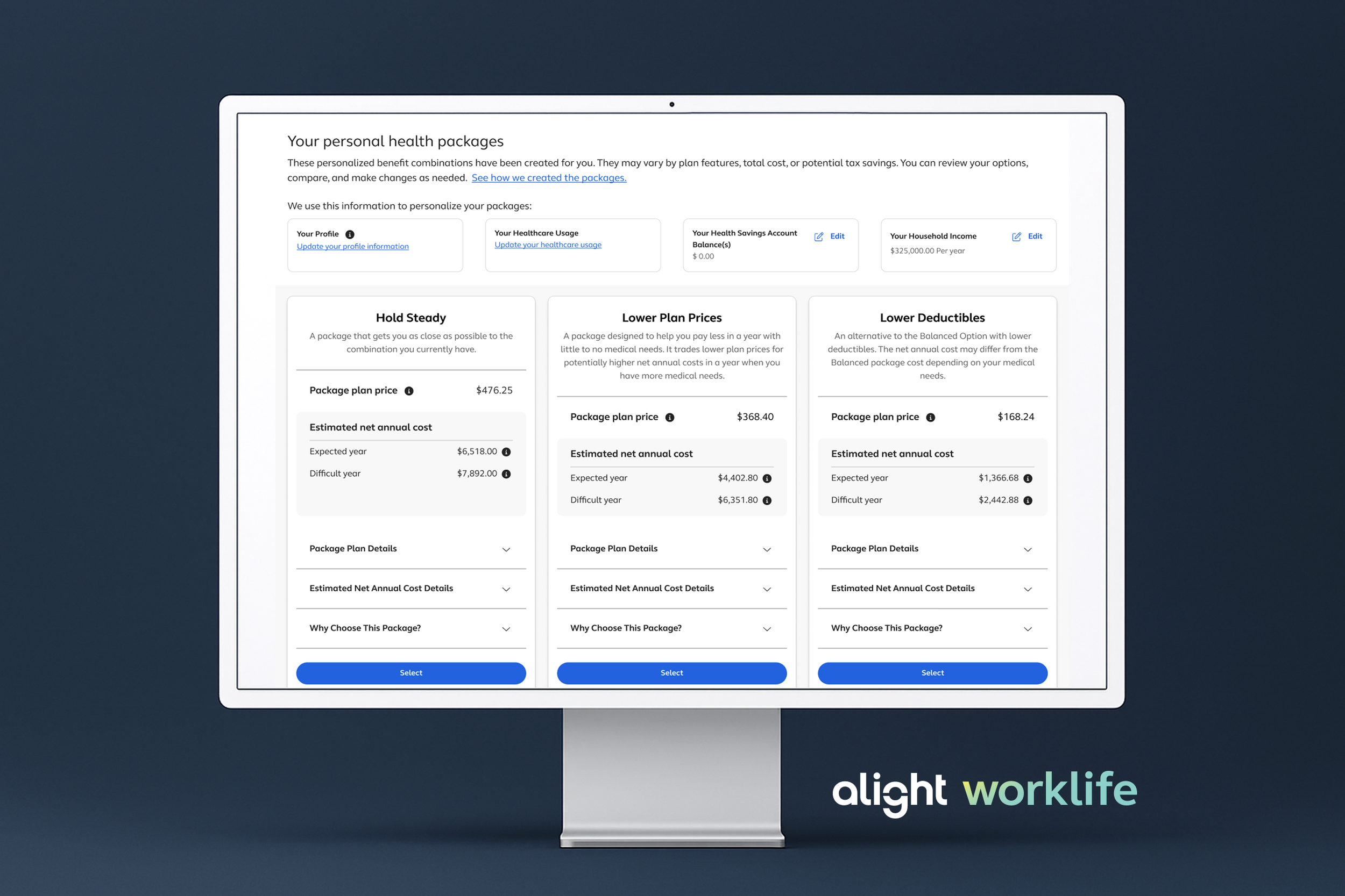
I partnered with the product team to define a new user flow aligned to our design approach, centered on two core principles. First, we introduced a consolidated Profile page to capture all key information upfront. Second, we designed a bundled plan system that surfaces tailored benefit packages based on the information provided in the Profile, creating a more personalized and efficient decision‑making experience.
What This Told Us
Navigation
Reduce click fatigue by prioritizing clarity, show a simple roadmap of where the user is and where they're going.
Let the User Drive
Display grouped items instead of one question per page so users can control what they see and choose where to go.
Personalization
Reveal how their answers are used and surface personalized bundles that build confidence throughout the flow.
Design Iterations
Early design
We partnered with UX Research to validate the Profile and Bundle experiences through unmoderated usability testing, which confirmed strong task completion while revealing key friction points and confusion.
Saving progress, skipping/progressing through sections, and overall flow efficiency.
Testing of the Bundle experience showed high user confidence and clear understanding of the bundled benefits concept, but also highlighted gaps in how personalization, enrollment actions, and editing options were communicated.
Constraints & How I Navigated Them
Navigating Complexity
The work evolved through multiple iterations with several key friction points. Rather than derailing progress, each constraint required clear decision-making and strategic trade-offs, here's how I navigated them.
Team Reorganization
Mid-project design team restructuring required me to re-establish ownership and keep momentum. I maintained delivery by clarifying accountability and adjusting sprint structure.
Savvi Integration
A partnership with Savvi introduced elements that closely mirrored our design direction. I led the integration strategy, adopting compatible components while protecting our design system integrity.
Scope Creep
Evolving stakeholder requests threatened the timeline. I led MVP scoping conversations with product around the Profile page, made explicit trade-off decisions, and documented what was deferred and why.
Final Design
The final experience positions the Profile as the central hub for all upfront questions, allowing users to control their path while clearly highlighting the most important decision points. Each section provides contextual guidance that explains how inputs contribute to the creation of personalized health packages, reinforcing confidence and transparency throughout the flow.
The Personal Health Packages, formerly the Benefits Bundle, evolved to incorporate select Savvi platform elements while preserving our original concept. The experience enables users to select or edit packages within a single, unified view, reducing friction and eliminating the need to navigate across multiple pages when plans do not meet their needs.
Results
10 out of 10 participants successfully completed the end to end enrollment experience
8 out of 10 average confidence rating in selecting a plan
10 out of 10 participants felt the packages were personalized to their needs
Impact & What’s Next
Impact:
Renewed client confidence
By modernizing a previously dated experience, addressing direct client feedback about visual and interaction debt. This redesign helped reposition Annual Enrollment as a modern, competitive product at a time when client confidence was at risk.
Increased confidence in a high‑stakes decision
Reduced cognitive load in Annual Enrollment, achieving a 100% completion rate and an average 8/10 confidence score in plan selection (in usability testing).
Simplified a complex, multi‑step flow
Introduced a Profile‑first hub that centralized upfront questions, improving early orientation and reducing page turn fatigue.
Proven personalization through recommendations
Validated personalized health packages as an effective decision model, with all participants reporting the experience felt tailored to their needs.
What’s Next:
While this work focused on improving the Annual Enrollment experience, long‑term success would be measured through a combination of experience, operational, and business metrics
Completion rate — % of employees who finish enrollment without assistance
Time to complete — Average time from start to submission
Post‑enrollment confidence — Self‑reported confidence in selections
Drop‑off at key steps — Reduced abandonment at decision points
Plan adoption rate — shift toward recommended packages and away from manual benefit-building, indicating users are making more confident, guided decisions
Support ticket volume during AE — Total support contacts and trend vs. prior year